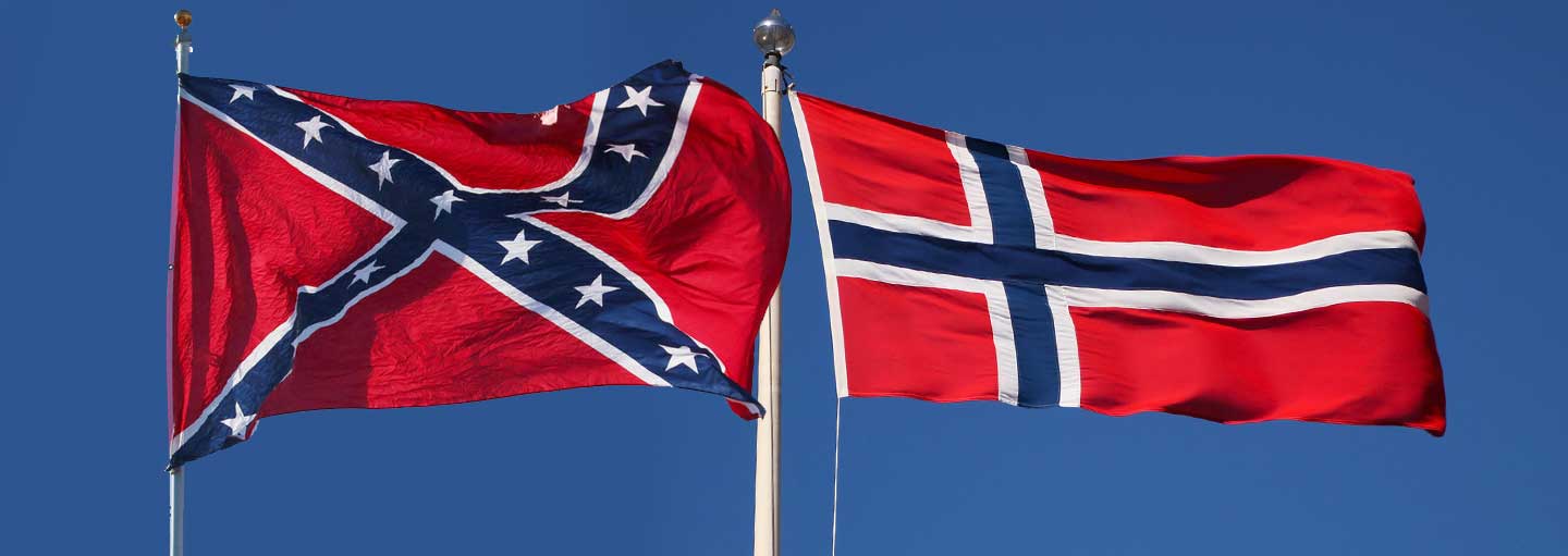
Combine forced school closures due to the Chinese Flu with Black Lives Matter protests and you end up with this story.
Owners of Michigan bed and breakfast The Nordic Pineapple removed the Norwegian flag at the front of their property after complaints from locals who mistook it for the Confederate flag.
The B&B owners, who had flown the flag to celebrate their Norwegian heritage, posted a statement on Facebook saying they had received dozens of hateful emails and so had decided to take the flag down.
Now if you’re not familiar with the Norwegian flag, it looks just like a Confederate flag – apart from the angle of the crosses which are vertical rather than diagonal, the blocks of red which are rectangular rather than triangular, and the absence of thirteen stars.
So, basically identical, aside from all the differences.
The Norwegian flag was designed in 1821 By Fredrik Melzer and there are two theories as to how the design came about.
The most popular theory is that Fredrik Melzer chose a Nordic cross to reflect the country’s close ties with Sweden and Denmark. And the colours red, white and blue to symbolize Norway’s affinity with other democracies like the UK and the USA.
The other theory is that Fredrik Melzer just really loved the Dukes of Hazzard.
In any case, the Norwegian flag looks kind of like the Confederate Flag, and especially more so if you’ve been skipping school.
So thanks to low information wokesters itching to find offence who don’t have a clue about the Civil War or the flags of that time but do rather enjoy running around playing Karen with their hair on fire … we are now cancelling stuff that looks like something.


